
Bettie Page
Volume One
For Volume One of Dynamite’s Bettie Page comic series, I was tasked with developing logo variants with trade dress treatments that summoned the spirit of the iconic 1950s pin-up model. Any approach had to highlight the character’s alluring, yet wholesome personality along with the mid-century setting.
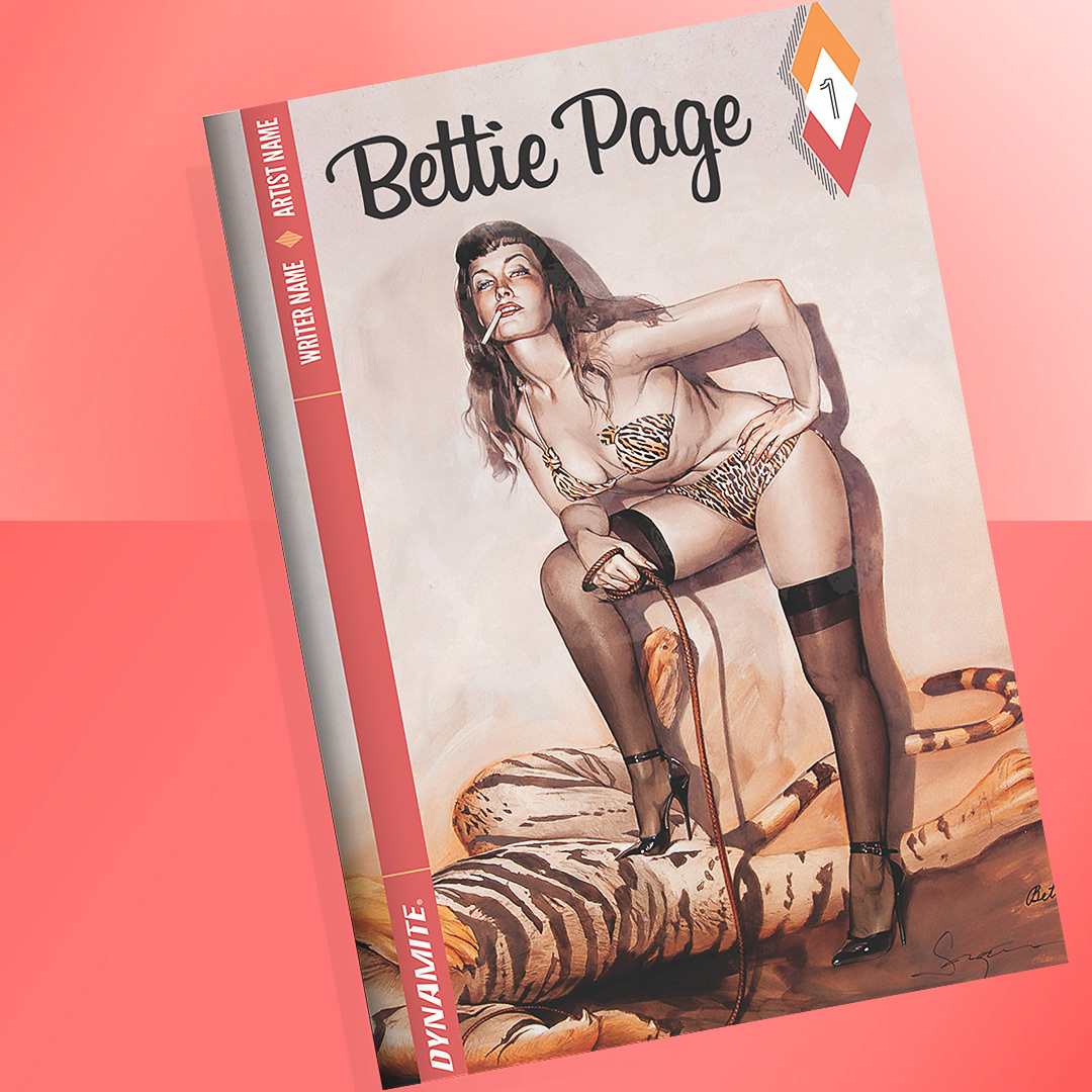
Bettie Page Series Cover Treatment
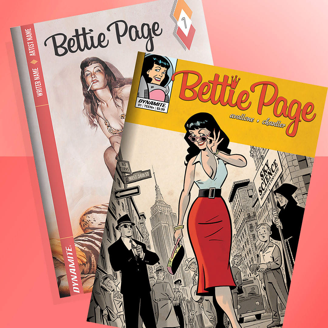
Bettie Page Series Vintage Cover Treatment
My Approach
The logos were inspired by classic 1950s typography, but with enough versatility to suit a variety of cover art and promotional materials. The example on the left showcases a cleaner approach, while the right embraces the nostalgic look and feel of vintage comic covers.
Reflections
This project allowed me to explore typographic design rooted in a pop culture context but with a more modern visual impact. Creating multiple treatments provided a way to demonstrate flexibility and how a logo can adapt to both contemporary and past design languages.
Praise
"Many of the trade paperback editions of my comics writing work for Dynamite have been designed and produced by Cathleen, and they have been uniformly excellent. Her work makes it easy for me to be proud of my own work, as it is presented with intelligence and care, in a beautiful, artistic package. Readers often comment to me on how beautiful the books are, and that's all the result of Cathleen's fantastic work. Highest recommendation!"
David Avallone
Writer, Bettie Page
David Avallone
Writer, Bettie Page
Clients
Bettie Page Estate
Dynamite Entertainment
Dynamite Entertainment
Project Type
Print Design
Typography
Logo Design
Magazine Cover Design
Comic Book Design
Typography
Logo Design
Magazine Cover Design
Comic Book Design
Tools Used
Adobe Illustrator
Adobe Photoshop
Adobe InDesign
Adobe Photoshop
Adobe InDesign